
AN ARCHITECT'S DIARY 010
How I Learned to See Colour

We’ve made it this far. We have an idea of proportion, silhouette and how our clothes drape. We’ve even chosen our fabrics with this in mind. But now it’s time to level up to the big leagues.
Now we need to look at colour.

This can be daunting, especially to those first starting out. What colours go with what? Which ones are the best? Does that last question even make sense?
I still remember facing this dilemma when I was younger. My solution? I simply didn’t play this game. For many years (especially during my SLP rocker phase) I just dressed in black, white and grey. I was still in my early years of architecture school too, so this approach definitely fit the whole cliched “architects wear black” stereotype.
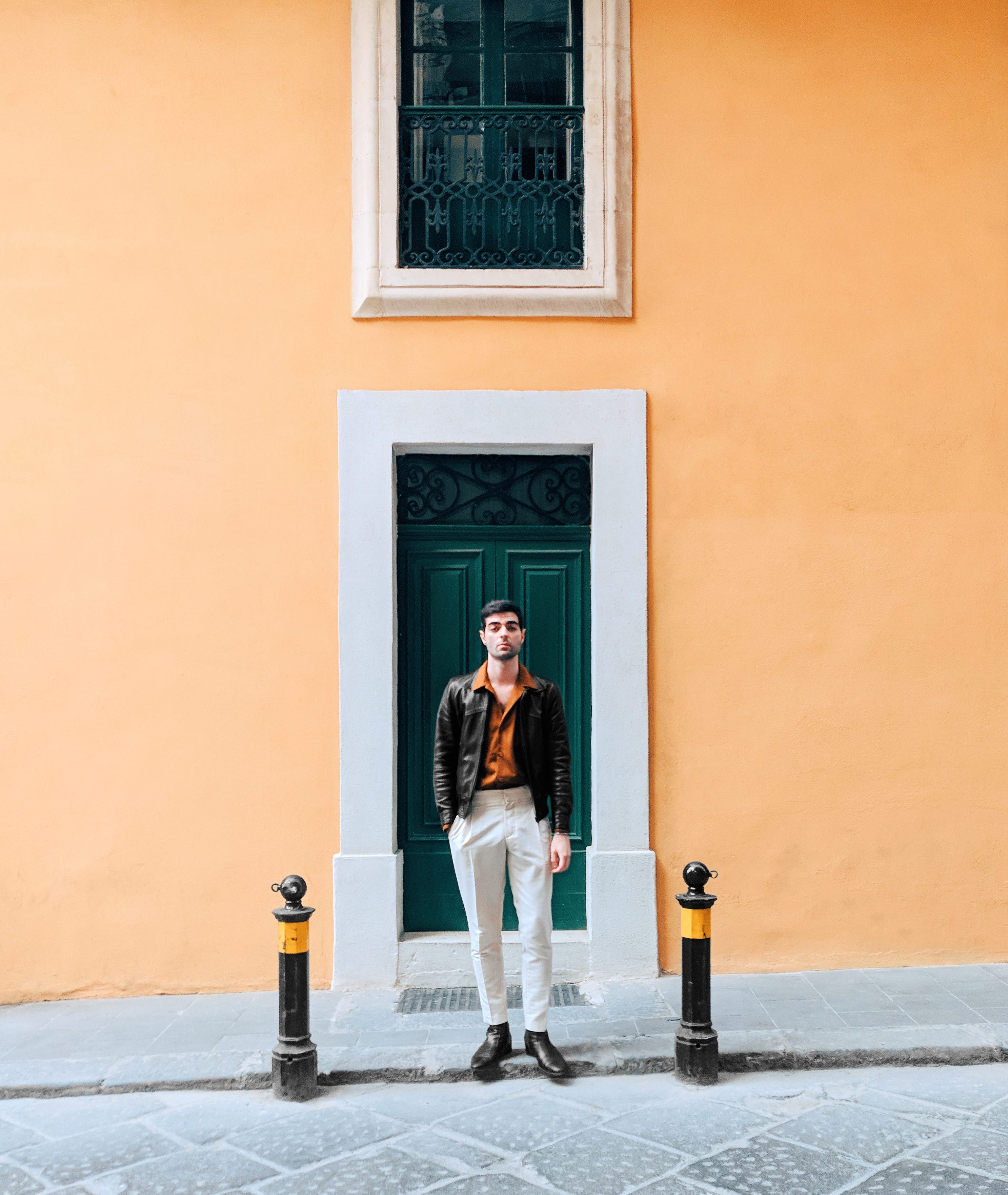
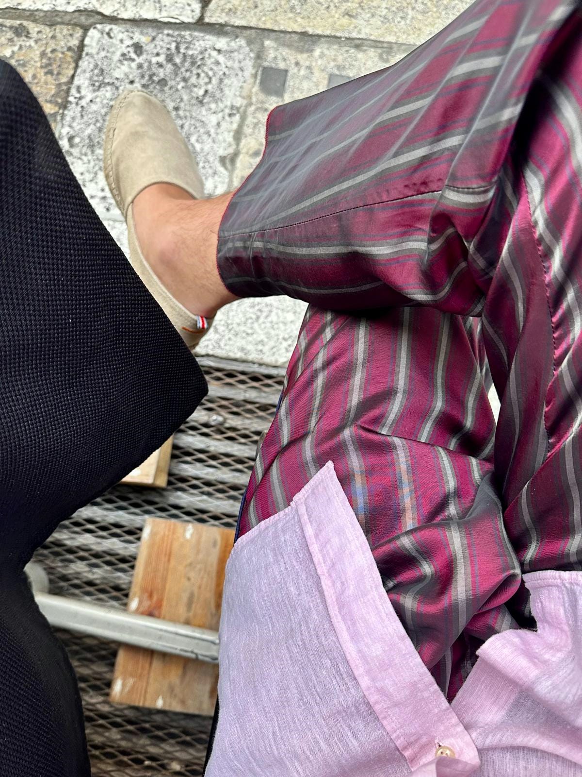
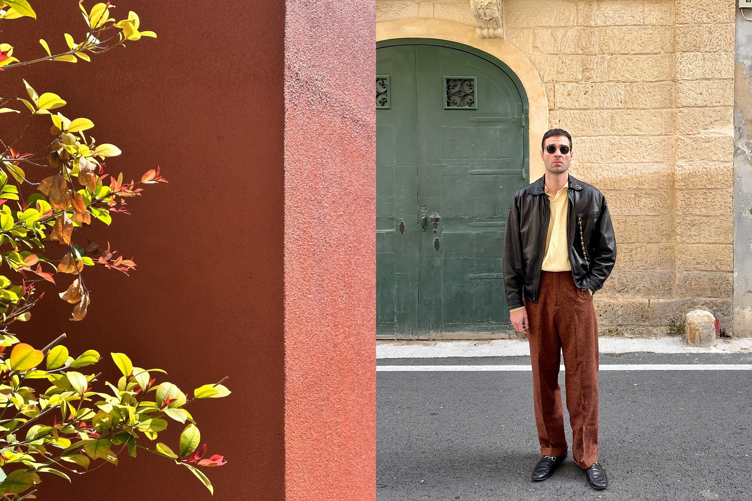
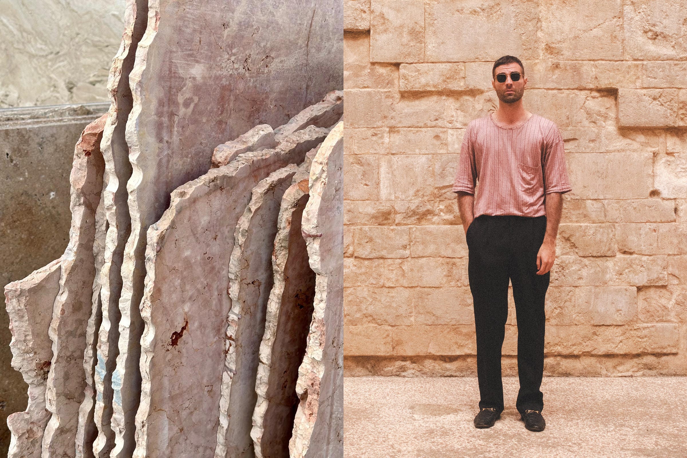
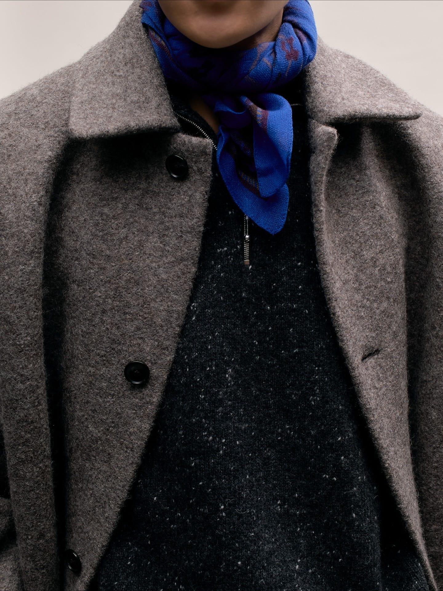
Gradually, I started incorporating colour. The photo above (from 2019!) is probably one of my most well known fits online where I’m not in full black. I’m still clearly in my SLP phase (note the pointy heeled boots and skinny leather jacket), but the trousers and shirt are doing something different. The pants still feature a strong taper from the knee down, but they’re not a full skinny cut throughout as I had been wearing then. I was slowly venturing out of my comfort zone.
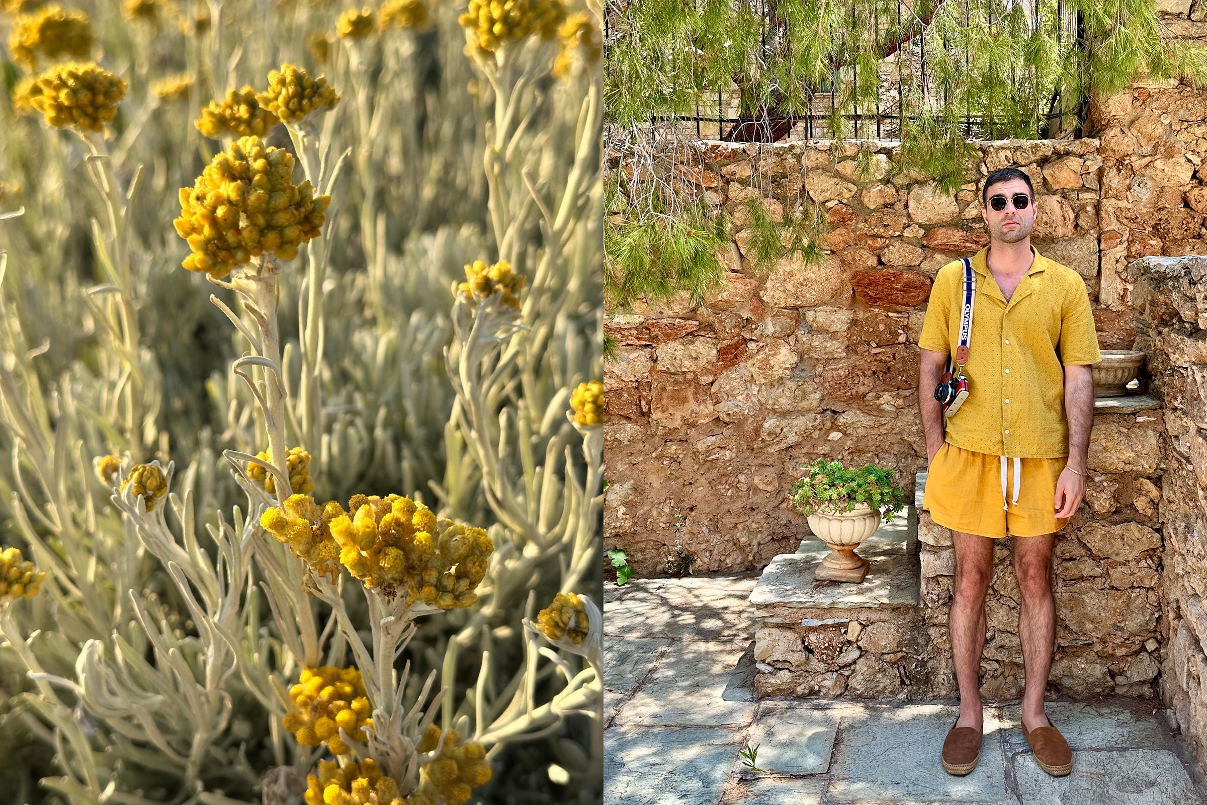
This was also around the time when I discovered (cue meme of caveman discovering fire) that cream/off-white pants + any colour under the sun is a winning combo. It just works.
How to Colour
I’m not going to make you go look at some colour wheels. That’s an easy cop out, and it’s been done (to death) already. If you’re really interested, you can look into tools that are specifically designed to extract colour palettes/schemes like Adobe Color (formerly Kuler) and come back. This would be the graphic designer approach of looking at colour theory.

For those who want to do a deep dive into colour, Josef Albers’ work on colour theory is a fantastic place to start.

Beyond that, there’s a couple of ways to go about this. Before we look into combining colours (which I know a lot of people have difficulty with), let’s start with the easy stuff…
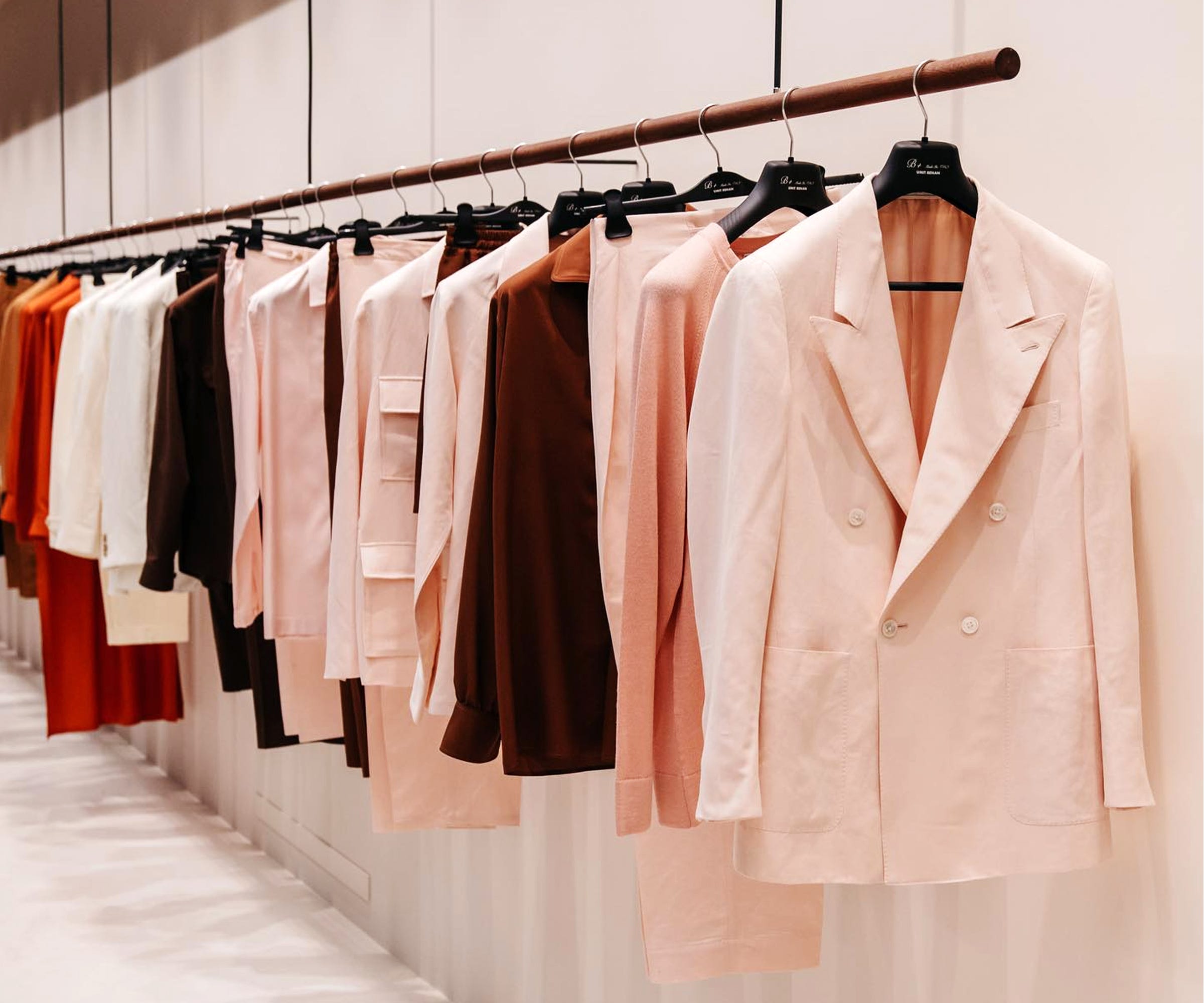
EASY: MONOCHROME
Do you know what goes with [insert colour here]? More of [insert colour here]. Who would have known eh? Hand this guy the Nobel prize. I’d like to thank the Acade- okay, fine, there’s a bit more to it than that.
The easiest way to go about this is to literally wear the same colour head to toe. Things start getting a bit more nuanced by opting for slightly different shades of the same colour in the same fit. This is essentially the Lemaire school of thought for wearing colour.
EASIER: IRL EYEDROPPER TOOL
Let’s raise the stakes a bit. Let’s say there’s a piece that already has a few colours going on. What do you wear it with? If you’ve ever used Photoshop (if you’re chronically online chances are you have) you should be already familiar with the concept of the eyedropper tool:

The idea here is to pick a colour that’s already present in the piece, and use it to anchor the fit. The other tactic here would be to pick a neutral colour/denim and call it a day. The latter approach works too, but it’s just less interesting. Let’s apply this to an example.
Say you really want this shirt:
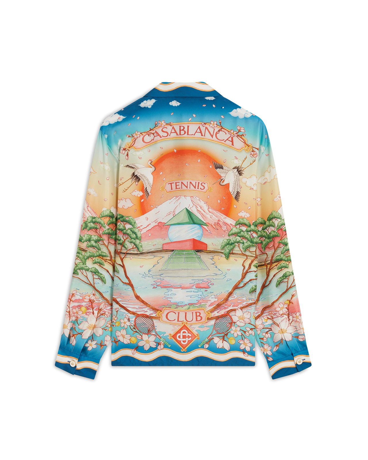
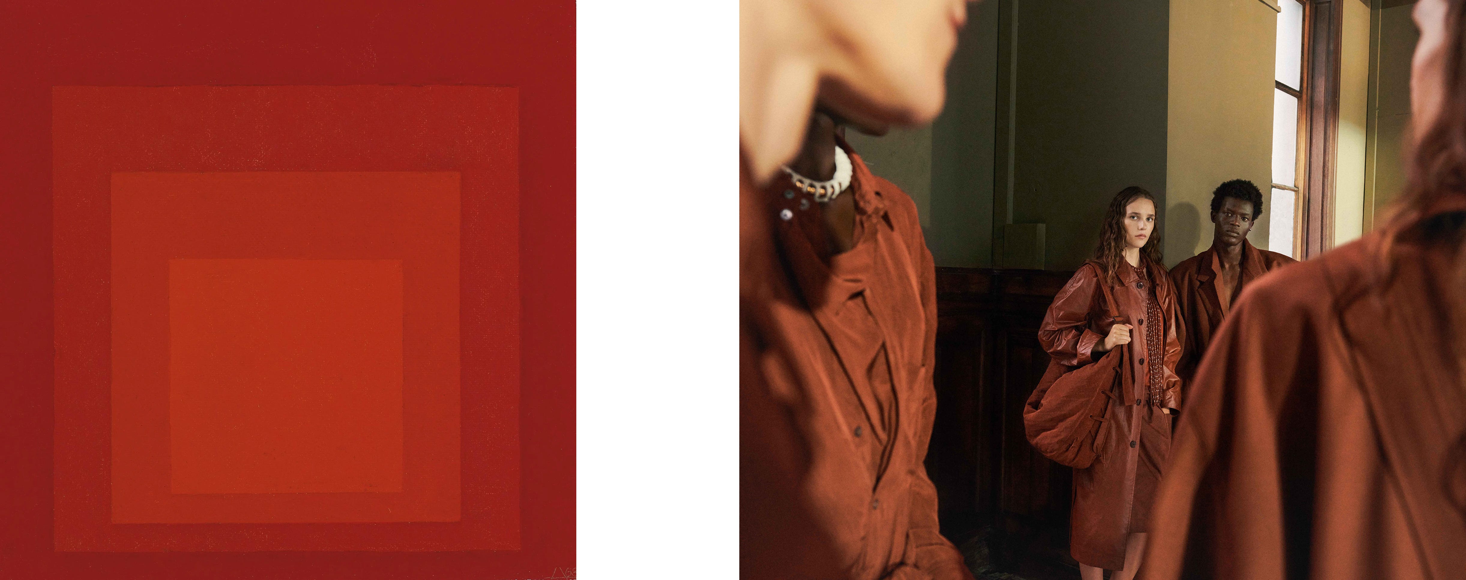
Arguably this generation’s answer to Gianni Versace’s decadence and opulence of the 80s and 90s, this Casa shirt here is the perfect example. You think I was gonna show an easy one? Flying cranes, lotus flowers, a tennis court with an impressive backdrop of Fuji IX Mount Fuji… there’s a lot going on here.
It features multiple colours, with the main ones being blue, white, pink, green and orange (pretty sure you could pick up others, like the yellow of the tennis balls). The way it was styled on their own website is actually a pretty safe bet - they went with white trousers. They’re a neutral, so they would have worked regardless, but it’s a better option than black as it actually features in the shirt’s crazy colour scheme.
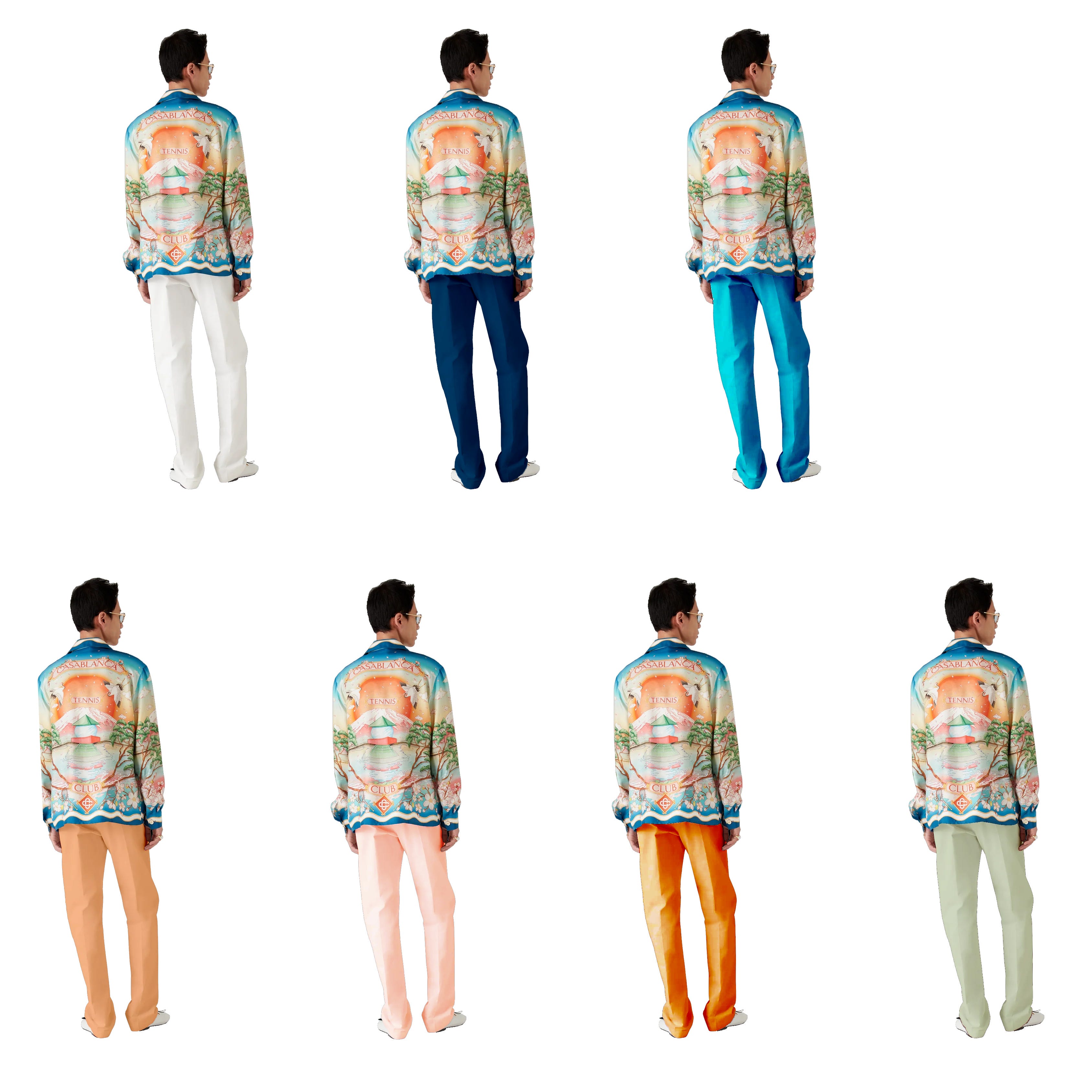
The above image shows this same shirt styled with different colours - all picked up from the shirt itself. Starting from the top, we have Casablanca’s suggested white, two different takes on blue (a safer navy blue and a bolder blue), a light orange (very difficult to find), a pastel pink, a saturated orange (bit easier to find perhaps), and a mint green. These all work cohesively with the shirt - it all depends on how comfortable you are with pulling off certain colours (and how tan you are).
EASIEST: TOUCH GRASS
No, I’m not being snarky (okay, just a bit… maybe). I’m a big believer in not reinventing the wheel for its own sake; it’s a mantra I apply when I’m doing architecture, as well as one when I’m deciding colour combinations. Turns out somebody already figured all of this out for us… it’s Mother Natureᵀᴹ.
A lot of designers are inspired by the natural world, and colour palettes are no exclusion to this endless source of inspiration. Flowers, stone, landscapes and even animals can give inspiration for unexpected colour combinations that might initially not be so obvious.
I don’t actively think about this when I’m combining colours - it’s more of a subconscious reference. It’s not about saying, “okay, so today I’m going to dress like that flower I saw last week”. I just think it’s important to be observant to what’s happening around you; there are moments of beauty everywhere - if you take the time to stop and actually look.
CURVEBALL: RULES ARE MEANT TO BE BROKEN
Disregard everything I wrote and do whatever you want. Really? Yeah, really. Okay not exactly, but I left this as a wildcard at the very end because the following is true:
“What colours go together?”
None. Be brave.
“Nothing is true, everything is permitted” works for Assassin’s Creed as much as it does for fashion. It may seem contradictory to this whole post, but at the end of the day, these are just guidelines based on what worked for me. What clothes we decide to put on everyday is an extremely personal choice. Once you form a basis of what works and doesn’t, you should have enough information to start forming your own taste and interpretation of this knowledge (editor’s note - some tastes are better than others, but thankfully, you’re already on the right track as you’re reading this blog).
I think it’s very important that one brings their own perspective to the table, especially in something as personal as fashion. We’re all different individuals. You’re meant to mess up in the process; and that’s okay too. I believe that being prescriptive when it comes to clothes is frivolous and quite frankly, a bit ridiculous. It’s meant to be fun!
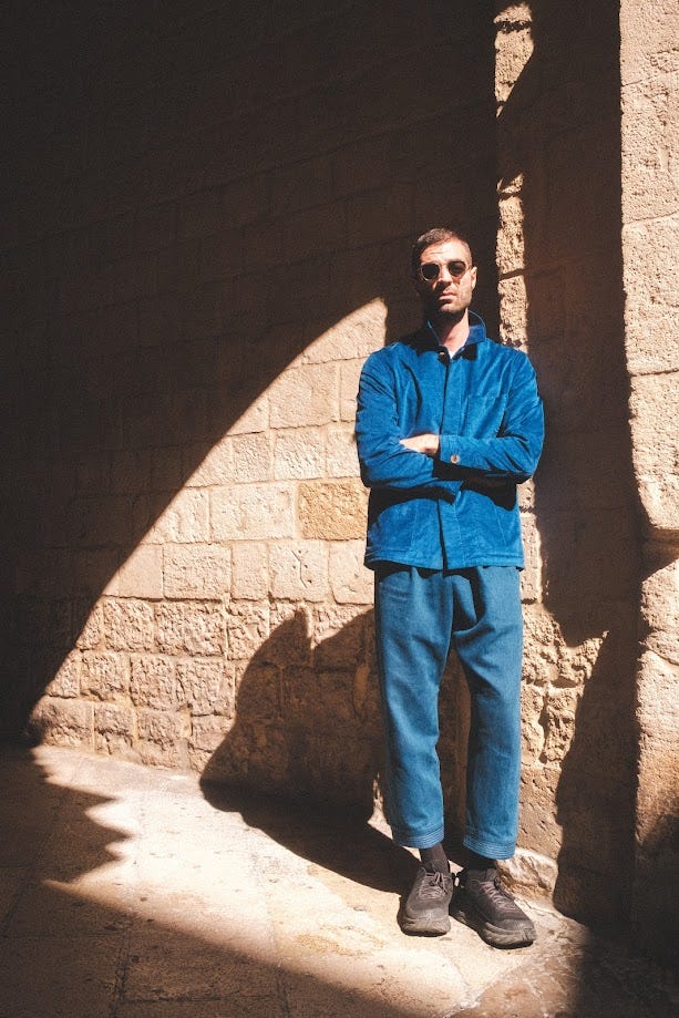
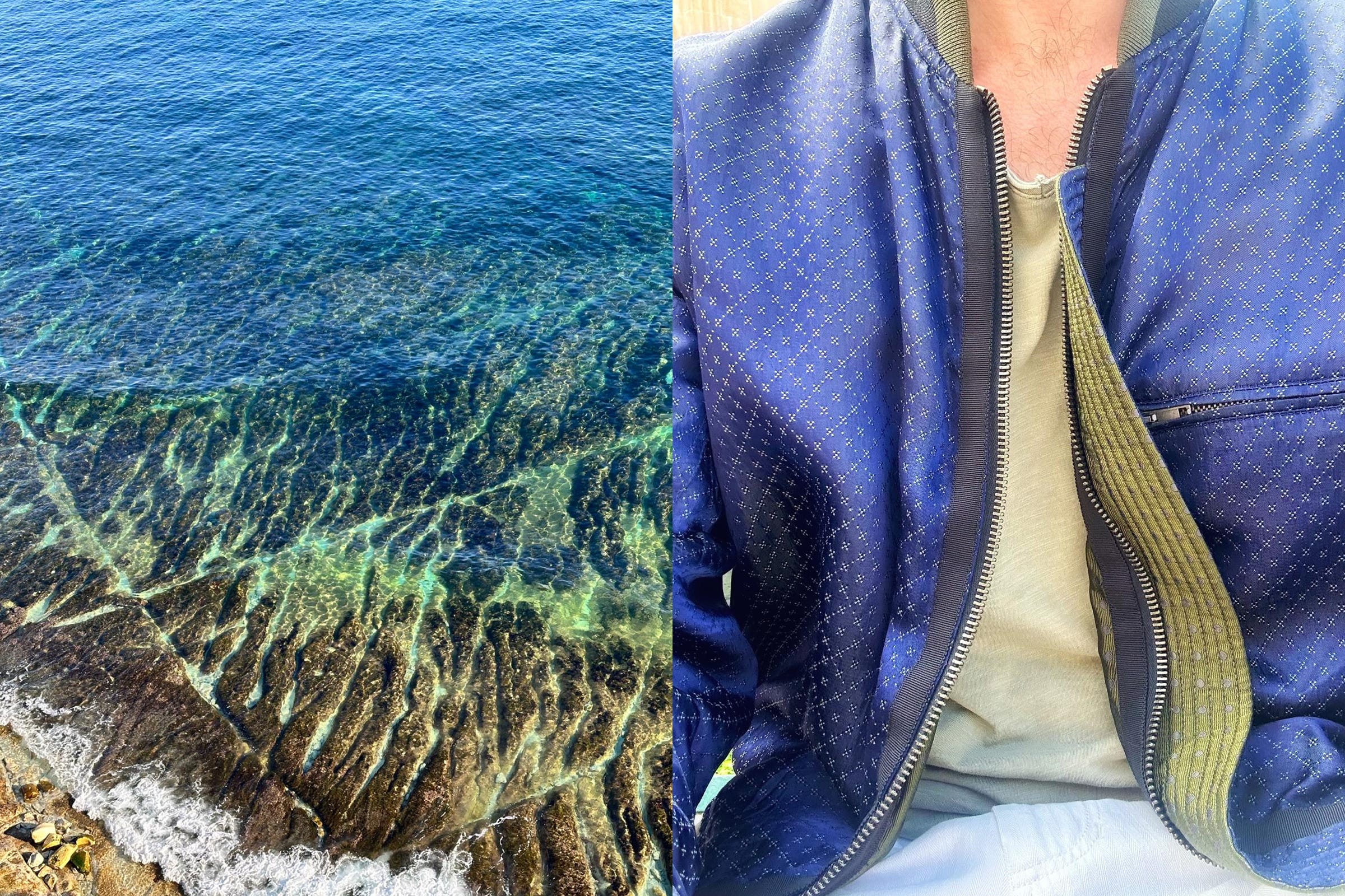
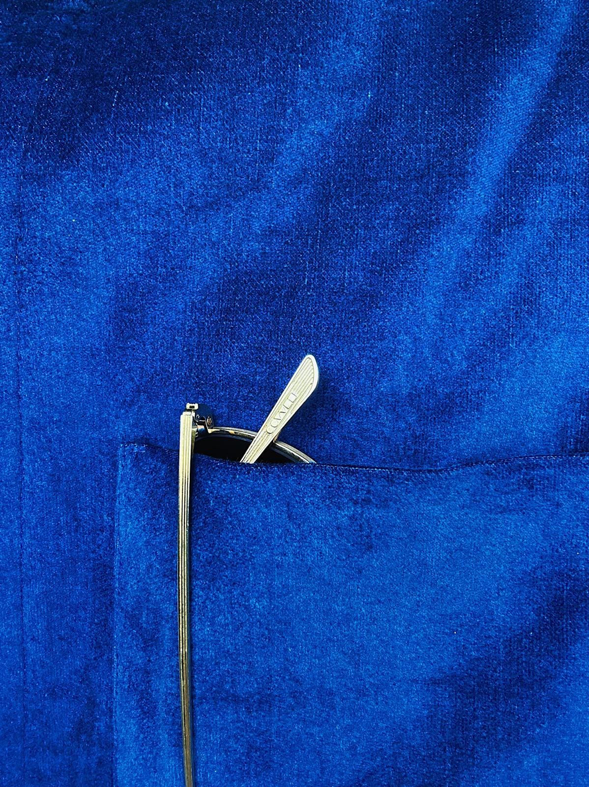
Next time we’re going to look at patterns. That’s where things are gonna get real crazy. Until then, here’s a picture of my favourite colour - it’s a deep blue shade known as Royal Blue. I just think it’s beautiful.
See you next time,
Chris